Optimizing Your Website for Mobile: Best Practices in 2025
Learn how responsive design, streamlined navigation, and mobile-friendly content can help your site succeed in a mobile-first world.
July 16, 2025

Share on
.png)
.png)
.png)
.png)
Imagine this: A potential customer lands on your website using their smartphone, but instead of a seamless experience, they’re met with slow load times, distorted images, and buttons too small to tap. Frustrated, they leave—possibly never to return.
In 2025, mobile optimization isn’t just an option; it’s a necessity. With Google prioritizing mobile-first indexing and users expecting lightning-fast, user-friendly experiences, businesses must adapt or risk losing valuable traffic.
Whether you’re revamping an existing site or building from scratch, this guide will walk you through the top mobile optimization strategies to ensure your website stays fast, user-friendly, and ahead of the curve. Let’s dive in!
1. Mobile-First Indexing for Better Rankings
Google now prioritizes mobile-first indexing, meaning it evaluates and ranks websites based on their mobile version rather than the desktop version. This shift highlights the importance of mobile optimization, ensuring that your website delivers a seamless experience across all devices.
Failing to optimize for mobile can negatively impact your **search rankings, traffic, and overall business growth**. If your mobile site lacks content, speed, or usability, Google may rank it lower, reducing visibility and conversions. Adopting a responsive design is no longer optional—it’s essential to keeping up with Google’s evolving algorithms.
Best Practices for Mobile Optimization
A mobile-first design approach ensures that your site is built with smartphone users in mind before scaling up for larger screens. By focusing on usability, speed, and clarity, you create a smoother experience that keeps users engaged and improves SEO performance.

Here’s how to optimize your site for mobile-first indexing:
- Responsive design – Ensure your site adapts to all screen sizes with touch-friendly elements (44×44 pixels).
- Fast loading speeds – Compress images, reduce code, and enable caching.
- Easy navigation – Use large, tap-friendly buttons and menus.
- Readable text – Choose clear fonts and proper text sizes for easy reading.
- Minimalist layout – Focus on essential content for a clean, user-friendly experience.
- Cross-device testing – Regularly check performance on various devices.
- Decluttered content – Use clear headings and concise text for better readability.
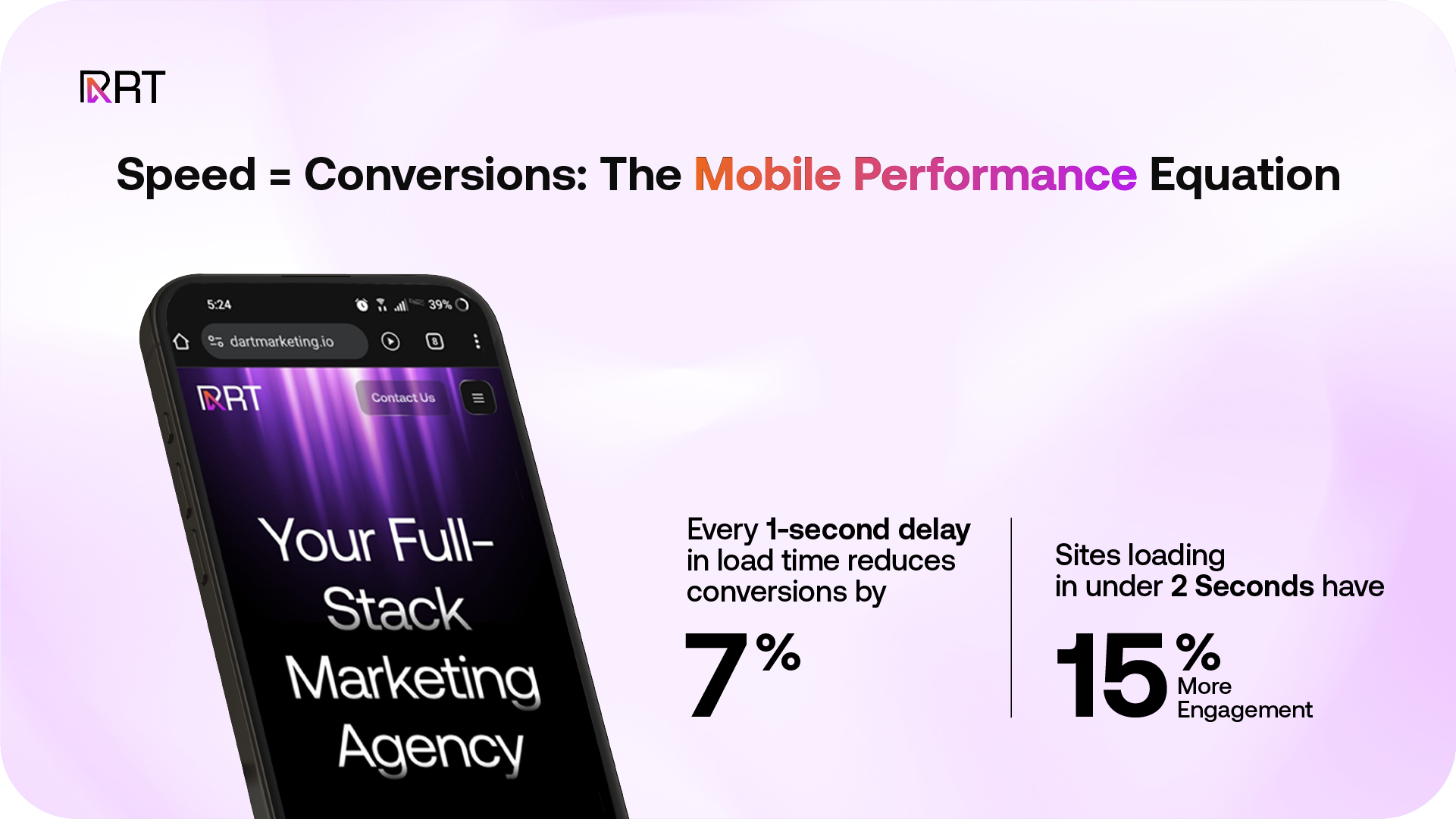
2. Website Speed and Performance on Mobile
Website performance is **crucial for user experience and SEO**. Faster loading times improve engagement, reduce bounce rates, and enhance search rankings. To achieve this, you must streamline content delivery by optimizing images, enabling caching, and minimizing page size.
How to Improve Mobile Speed
- Minimize HTTP requests – Merge CSS and JavaScript files and remove unnecessary scripts.
- Enable compression – Use Gzip or Brotli to shrink file sizes for faster loading.
- Optimize images – Convert images to WebP or AVIF and use responsive image techniques.
- Implement lazy loading – Load media only when needed to save bandwidth.
- Leverage a CDN – A Content Delivery Network (CDN) reduces latency by serving content from the closest server. Many hosting providers, like Bluehost, offer free Cloudflare CDN integration.
- Refine fonts & scripts – Preload essential fonts and minimize third-party scripts to enhance performance.
A fast mobile site isn’t optional—it’s a must. Poor speed can cost you visitors, rankings, and conversions, impacting business growth.
3. Improving Mobile UX & Navigation
A high-quality mobile experience is no longer a luxury—it's a necessity. To meet user expectations and support strong search performance, your site must load quickly, adapt to any screen, and offer easy navigation.
Responsive Design – Ensure your layout adjusts seamlessly to different screen sizes for effortless browsing.
Performance Optimization – Improve load times by minimizing file sizes and avoiding heavy scripts.
Mobile-Specific Layouts – Use media queries to fine-tune your design for mobile screens.
Core Web Vitals – Track loading speed, responsiveness, and visual stability to boost user experience and rankings.

Simplified Mobile Navigation
On small screens, clear navigation is crucial.
- Hamburger Menus save space while keeping navigation accessible.
- Organized Links help users find key pages quickly.
- Intuitive Design ensures users can move through your site with ease.
Interactive Mobile Features
Interactive elements improve engagement when used wisely.
- Micro-animations offer feedback for user actions.
- Touch gestures like swipe and tap enhance usability.
- Purposeful design keeps the focus on what matters.
Focusing on these areas ensures your mobile site is fast, user-friendly, and ready to perform.
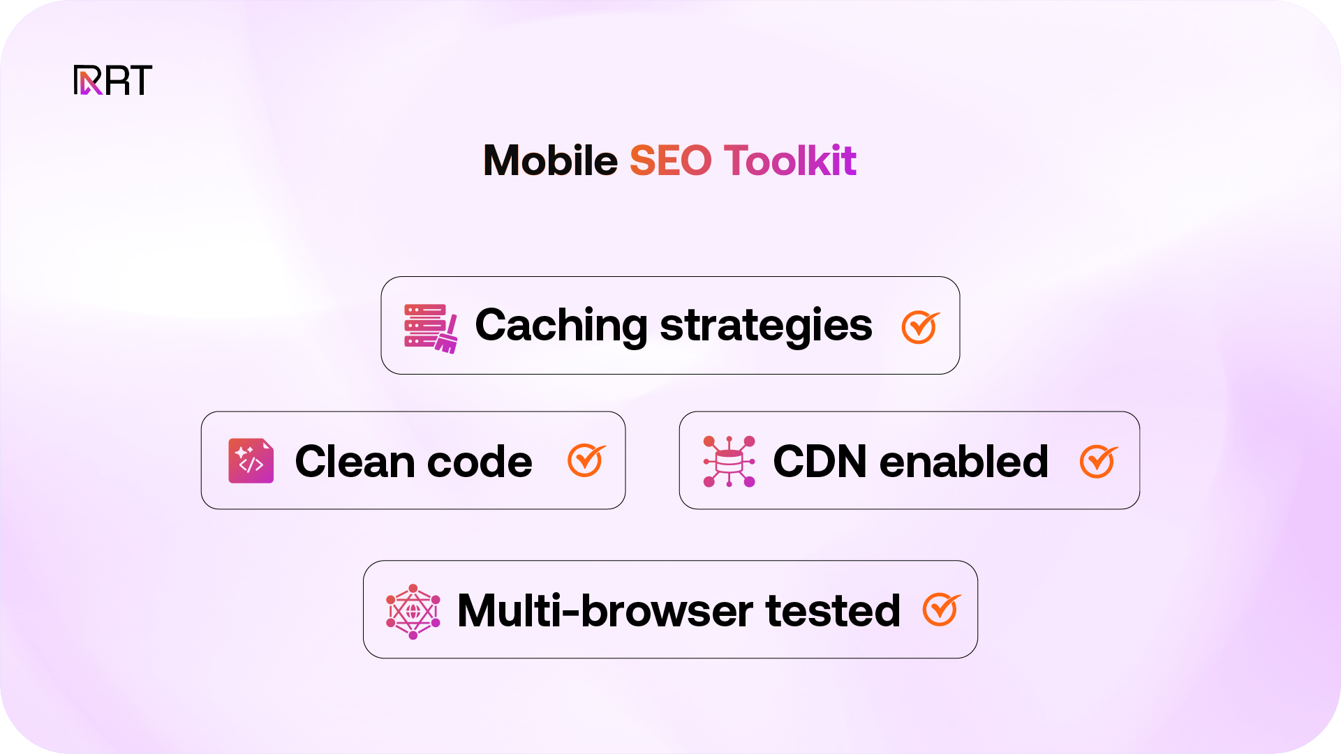
4. Technical SEO for Mobile Sites
Strong mobile performance depends on well-executed technical foundations. These ensure your site loads quickly, functions smoothly, and delivers a seamless user experience.
- Multi-Browser Compatibility – Test your site across major browsers and devices to ensure consistent performance.
- Caching Strategies & CDNs – Utilize browser caching and content delivery networks to decrease load times and improve efficiency.
- Modern Development Practices – Keep up with current coding standards and web technologies to future-proof your website.
Smarter Responsive Design Techniques
Instead of building separate mobile versions, leverage advanced responsive design tools to create a unified experience across devices.
- Flexible Layout Systems – Use CSS Grid and Flexbox to design layouts that adjust naturally to screen size changes.
- Enhanced Media Queries – Define breakpoints based on content structure, and explore Level 4 features like
aspect-ratio. - Responsive Text Sizing – Apply functions like
clamp()and viewport units to scale typography smoothly. - Container-Based Styling – With container queries, elements can adapt based on their parent containers for more refined control.
- Adaptive Image Delivery – Use
srcsetand<picture>elements to deliver images optimized for screen size and resolution. - Modern CSS Features – Utilize CSS variables and logical properties to create flexible, theme-consistent layouts.
These methods make your site more manageable and scalable, delivering a consistent experience without maintaining separate mobile versions.
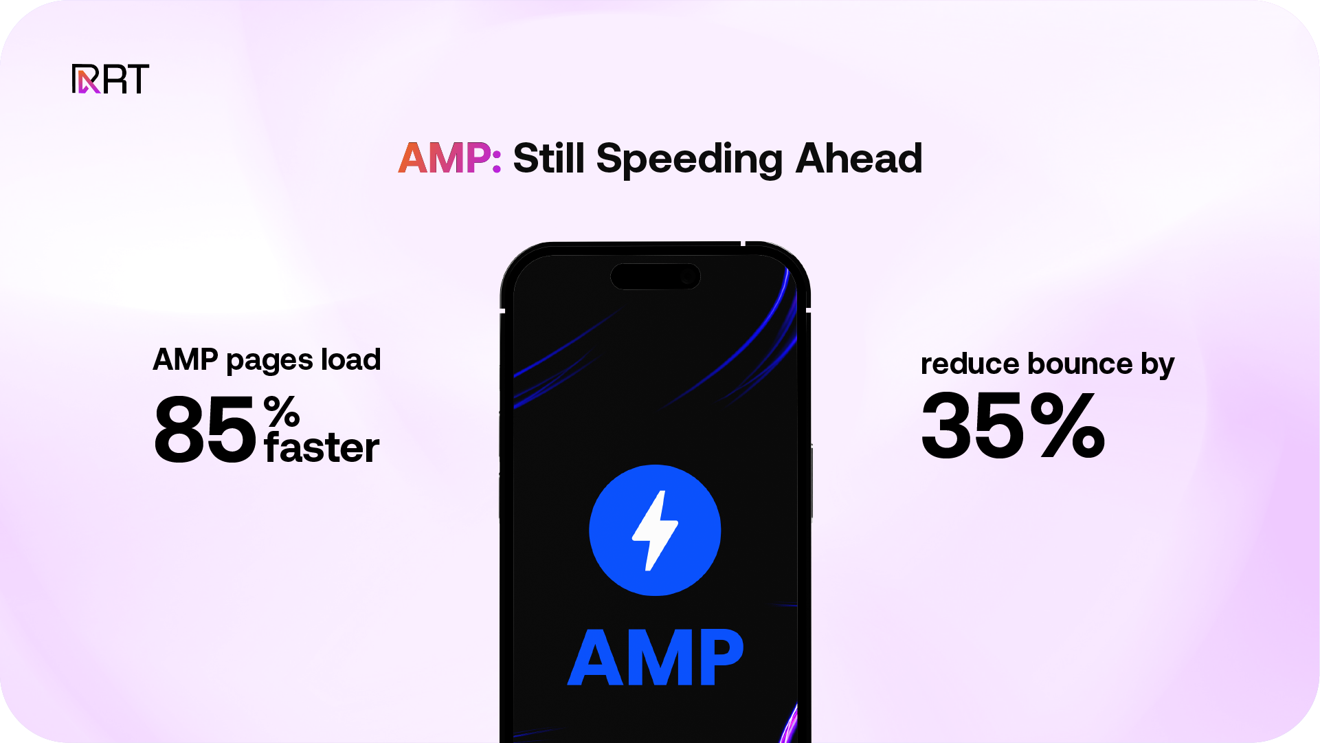
Why AMP Still Matters in 2025
Accelerated Mobile Pages (AMP) remain an effective way to enhance mobile performance by streamlining code and focusing on speed.
- Instant Load Times – AMP pages load quickly, reducing user wait time and improving engagement.
- Improved SEO – AMP’s performance benefits align with search engine ranking factors, helping boost visibility.
- Higher User Retention – Fast content delivery keeps users on your site longer, increasing mobile conversions.
In the mobile-first landscape of 2025, AMP continues to support better performance, greater reach, and a more engaging user experience.
5. Mobile Security Best Practices
Strong security is essential for mobile-friendly websites. It protects user information and reinforces trust in your brand.
- Implement HTTPS – Use SSL certificates to encrypt data and ensure safe communication between users and your server.
- Update Regularly – Keep your site’s platform, plugins, and themes current to eliminate potential vulnerabilities.
- Use Two-Factor Authentication – Add an extra security step to prevent unauthorized account access.
By making security a priority, you not only safeguard sensitive data but also build user confidence and preserve your brand’s credibility.

Wrapping Up…
In 2025, mobile optimization is no longer a competitive edge—it’s a requirement. With Google’s mobile-first indexing, evolving user expectations, and lightning-fast tech advancements, your website must deliver speed, simplicity, and seamless experiences on every screen.
By embracing responsive design, improving Core Web Vitals, optimizing for performance, and prioritizing user security, you’re not just meeting standards—you’re future-proofing your digital presence.
A mobile-optimized site doesn’t just attract traffic—it keeps users engaged, builds trust, and drives real results. Now is the time to fine-tune your mobile strategy and stay ahead in a mobile-first world.
Share on
Keep up with the latest & greatest in growth marketing

Marketing That Always Hits The Mark
Dart Marketing is a full-stack growth marketing & creative agency based in the US, UAE, AUS, and Pakistan.
Copyright @ 2025 Dart | All Rights Reserved